Overview Dashboard — Key Brand Visibility Metrics in AI
How to read the BrandWise dashboard: KPI cards, trend charts, scenario comparison table, Key Insights, and competitive analysis. Navigation, filters, and data interpretation.
Navigating to the Overview Dashboard
The overview dashboard is the main analytics page for your project. To access it, click Reports in the project sidebar. The page has three tabs:
| Tab | What It Shows |
|---|---|
| Overview | Aggregated KPIs, trends, and scenario comparison for the selected period |
| Runs | List of individual evaluation runs with dates and statuses |
| Custom Reports | Builder and library for custom data queries |
The Overview tab opens by default — this article covers its contents.
Filters: Date Range and Scenarios
Two filters at the top of the dashboard define the analysis scope:
Date range filter with presets:
- Today, last 7 / 14 / 30 / 90 days
- This week, last week
- This month, last month
- Custom range with date picker
Scenario filter — select one or more scenarios for the analysis. All project scenarios are included by default.
Changing filters instantly recalculates every widget on the page.
KPI Cards
Below the filters, the Overall Score is displayed as a ring indicator with color coding:
| Score Range | Color | Level |
|---|---|---|
| 70–100 | Green | Excellent |
| 40–69 | Yellow | Average |
| 0–39 | Red | Weak |
Four KPI cards appear next to the ring:
- Mention Rate — percentage of responses that mention the brand
- Top-1 Rate — percentage of responses where the brand is recommended first
- Top-3 Rate — percentage of responses where the brand ranks in the top three
- Avg Position — average brand position among mentioned alternatives
Each card includes a progress bar for quick visual assessment.
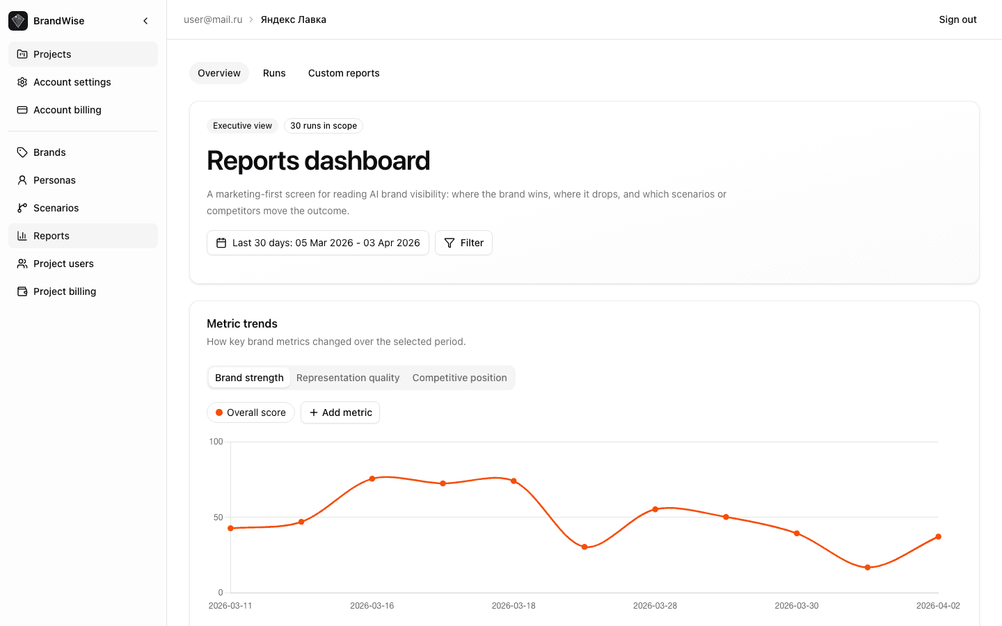
Metric Trend Chart
Below the KPIs, an interactive line chart shows metric dynamics across scenarios over the selected period.
Left axis displays metric scores (0–100):
Right axis — average Mention Rate (%).
Each scenario is plotted as a separate line. Hovering over a data point shows the exact date and metric value. Switching metrics lets you focus on specific aspects of brand visibility.
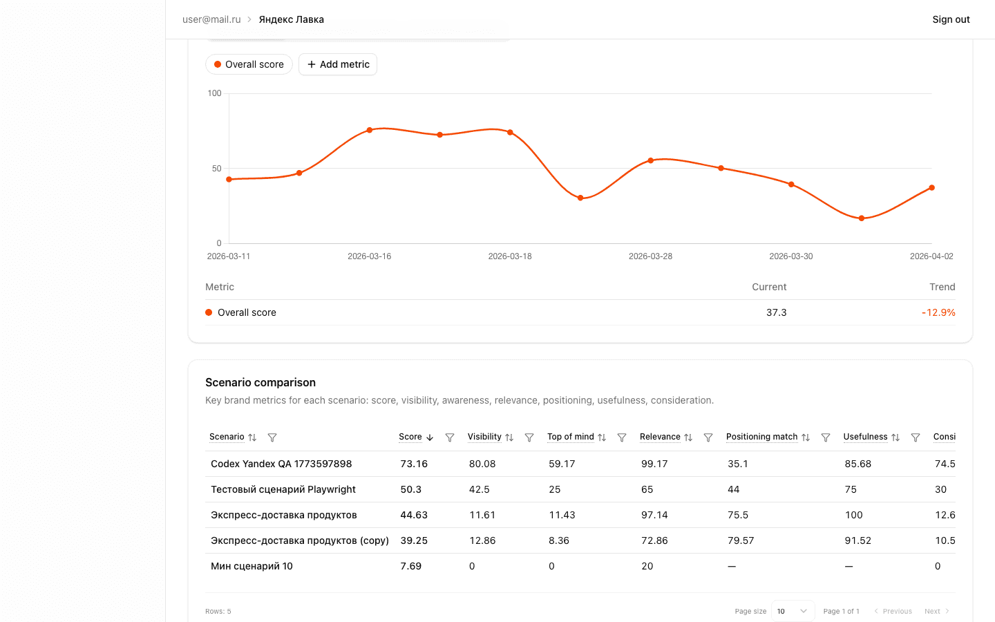
Scenario Comparison Table
The table compares all project scenarios across the full metric set:
| Column | Description |
|---|---|
| Scenario | Name + baseline/blind badge |
| Overall Score | Aggregate visibility score 0–100 |
| Visibility | How prominently the brand appears |
| Top of Mind | Whether the brand is recalled first |
| Relevance | How well the response matches the query |
| Positioning Match | Alignment with brand positioning |
| Usefulness | How actionable the recommendation is |
| Consideration | Inclusion in the shortlist |
Click any column header to sort — quickly identify the strongest or weakest scenario.
Scenario badges:
- Baseline — the primary scenario used as a benchmark
- Blind — a scenario without brand name in the prompt, measuring "organic" visibility
Comparing baseline and blind scenarios reveals the gap between prompted and natural brand awareness in AI. Learn more about scenario types in the scenario creation guide.

Key Insights — Automated Findings
The Key Insights section is generated automatically from the current period's data. Each insight has a priority level and icon:
| Type | When It Appears |
|---|---|
| Best model | One model consistently scores highest |
| Worst model | The model with the lowest score — requires attention |
| Score increase | Overall Score improved compared to the previous run |
| Score decrease | Overall Score dropped — a potential issue |
| Low Mention Rate | The brand is mentioned below the threshold |
| High score, low mentions | High scores when mentioned, but mentioned rarely |
| Weak sub-metric | One of the 6 metrics significantly lags behind the others |
| Low confidence | Data Reliability is below normal — insufficient data for reliable conclusions |
Insights are ranked by importance — critical issues appear first. Use them as starting points for analysis: each insight points to a specific area requiring attention.
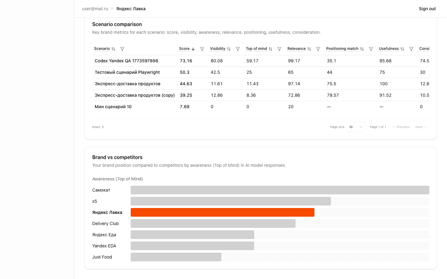
Competitive Analysis: Brand vs Competitors
At the bottom of the dashboard, a competitive landscape visualization shows how your brand compares to the competitors listed in your brand profile.
A horizontal bar chart displays Top of Mind for each brand — yours and competitors. The longer the bar, the more frequently AI models recall the brand first.
Additional metrics in the table:
- Mention Rate — share of responses with a mention
- Top-3 Rate — share of top-three appearances
- Avg Position — average position in recommendation lists
- Delta — difference relative to your brand
Use the competitive analysis to identify who AI models recommend instead of you and plan actions to improve your position.
Using the Dashboard for Decision-Making
- Weekly monitoring: set the period to "last 7 days" and track Overall Score trends
- Scenario comparison: use the table to find weak scenarios — they may need intent refinement or strategy changes
- Insight review: check Key Insights after each run — they highlight anomalies
- Competitive audit: use the competitive section to understand how AI attention is distributed between you and competitors
- Drill down: for deep analysis of a specific run, navigate to the run report page
Next Steps
- Run Report: Detailed Results Analysis — breakdown of Overview, Dialogs, and Competitors tabs
- Custom Reports: Builder and Presets — creating custom data queries
- BrandWise Metrics — detailed description of all 6 metrics and scoring formulas
- Create an account and get started
Derived and Aggregate Metrics in BrandWise
Overall Score, Confidence, Mention Rate, Top-1 Rate, and other aggregate metrics in BrandWise. How they're calculated, what they mean, and how to use them.
Run Report — Detailed AI Brand Evaluation Results Analysis
How to read a BrandWise run report: Overview, Dialogs, and Competitors tabs. Hero cards, model heatmap, intent table, dialog transcripts, and competitor matrix.